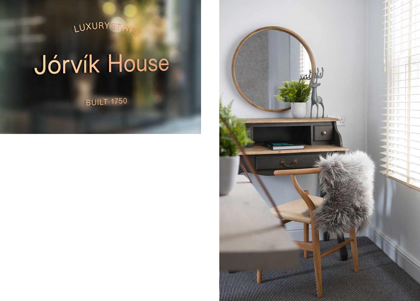
Jorvik House is a boutique hotel in city centre York that draws inspiration from the city’s rich history and Viking heritage combined with modern Scandinavian design to create an exclusive and luxurious getaway. We were approached to work with the hotel from naming through to brand identity development, website, print and signage design.
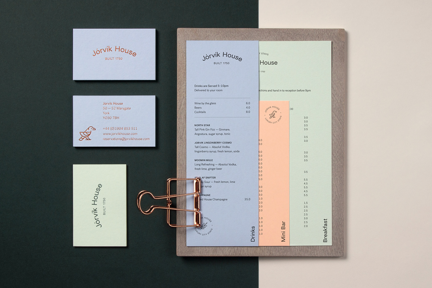
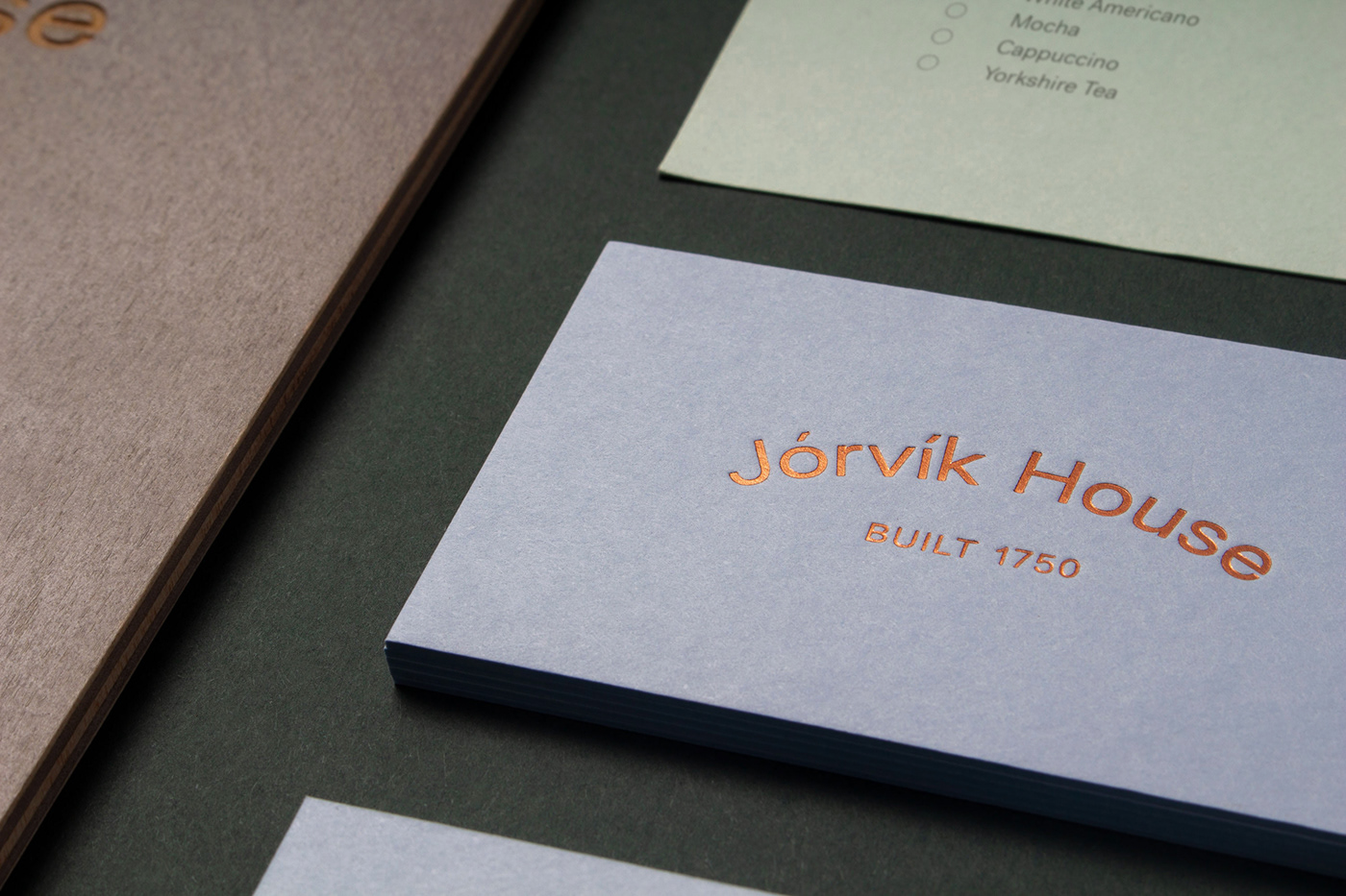
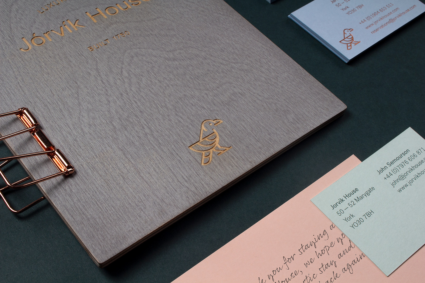
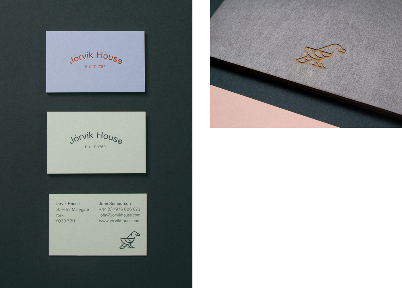
Jorvik House’s identity includes a modern Scandinavian inspired logotype that is expressed in a number of lockups to give the brand flexibility while remaining simple and minimal. Alongside the logotype is a primary brand symbol of the Raven. Designed as a friendly and welcoming character and inspired by Viking mythology, it plays a key role in linking the hotel’s history and the contemporary minimal design style.
These are supported by secondary stamp marks including a Yew branch – inspired by the etymology of the name Jorvik which became known as York – to create a set of brand assets to convey a modern and minimal Scandinavian identity that has its basis in the history and stories of the city.
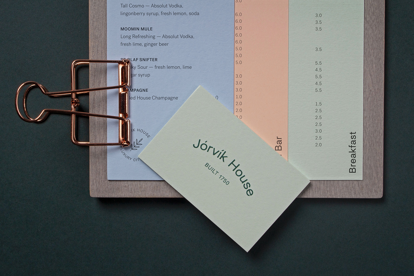
A full set of brand stationery was printed using quality uncoated stocks from the brand palette with copper foil details. Wooden, laser-etched menu boards were created to support the system of menus designed for easy in-house print and use.
Alongside developing the brand identity across physical assets, we worked with Jorvik House to design and build a website to express the hotel's ethos and identity online and to echo the quality of visitor experience in person when booking a room.